One way to convey naturalism and vitality is through green. It is considered a good bet for decoration, as it enriches the environment and can be combined very well with other shades. Anyway, it must be taken into account that there are several ranges, some stronger and more intense compared to others more calm and dark. It’s all a matter of choosing the most appropriate one.
HAS GREEN ALWAYS BEEN YOUR FAVORITE?

Make it the absolute protagonist of the decoration. With spectacular prints you have it very easy. Of course, choose them with subtle color variations to avoid a monochromatic atmosphere. These large-scale flowers on the curtains, and the marble that emulates the beauty of a hand-painted fresco on the wall, exude style.
A FOREST AT MINI SCALE

The eucalyptus branches and the trunk-shaped vase are an example of how green, in small doses, has an impact. It is essential that it be combined with good design and highlighted with earthy colors, such as those of the paper from the Carmen collection, by Eijffinger, in Coordonné.
JOY, FRESHNESS AND LIGHT

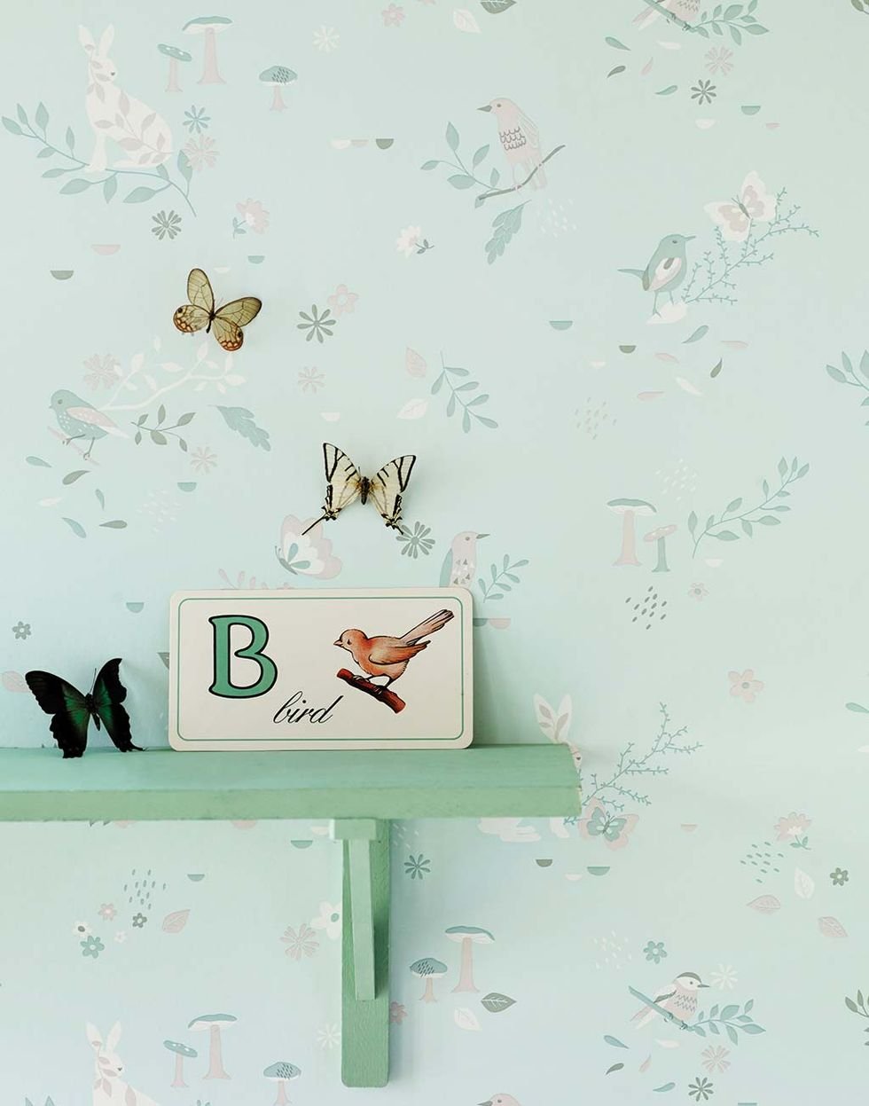
Mint green multiplies them in any space. It enhances its tone with the contrast of another green a darker point, as was done here with the shelf. The option of a white shelf is always there, but what if you try an additional green brushstroke? Secret Garden Paper, by Piccolo Mondo.
TRIANGLES HERE AND THERE

Green is worn and also geometric motifs. So when these two decorative hits come together and are combined with a lot of creativity, interesting designs emerge like this Palmier paper, by Caselio. Style plus: green touches on textiles and natural wood.
MIDDLE TONES

The new greens to paint the walls opt for the so-called medium tones. They are not light or dark, neither are they bright, and they look somewhat grayish. Its decorative effect? Pure calm and sophistication. And excellent news: they go well with woods, black and the range of naturals, such as the dark peach in the image.
BODY AND MIND IN RELAX MODE

If contemplating a meadow or the forest has an anti-stress effect for you, a healthy solution is to decorate your bedroom with green tones. Did you know that experts say that green is the most relaxing color for the human eye?
THE DARK RANGES

If you have plants at home, it is most likely that with their leaves you have already incorporated the darker shades of green into the decoration, but you can go one step further and introduce them into an upholstered piece of furniture. Bottle green, an intense olive, pine color or the darker tones of English green, add elegance to the decoration. You just have to hit with a chromatic counterpoint that enlivens them.
YOU CHOOSE THE DOSE

And at the table… If you like to try new recipes and oriental gastronomy fascinates you, get ceramic plates in a celadon green tone. You will surprise everyone with its special aromas and flavors in a très chic presentation. Gres Shima, by AM.PM for La Redoute Interieurs.
COMBINED WITH PINK

It is one of the trends that we have seen at Casa Decor 2019, in this case in Raúl Martins’ space.
IN THE WALLS

This 35m2 apartment decorated by Jean Porsche gives us two clear lessons: that a successful decoration does not depend on the square meters and that a room is never too green.
GOLDEN TOUCHES

Paula Ordovás’s house is pure inspiration. It is also pure trend and, although we have not fully entered spring, she has already opted for the star combination of the season: green and gold. As you can see, the mix could not be more winning.
IN THE BEDROOM

You don’t have to do major renovations to let the green in at home. The bedroom can be a good place to start with these H&M Home textiles. Unbeatable combination with brown tones.
A CLASSIC

The Smeg brand and its products need no introduction. Nor is it necessary to explain your passion for colors. The classic and the trend become one in this toaster that is the subtle way to make room for green in your kitchen.
IN THE KITCHEN

Now, if we talk about kitchens, we cannot avoid mentioning this Belgian-inspired design by Deulonder, only suitable for convinced lovers of the color green. When combining it, the cream color of the marble, the gray of the handles and visible hinges and, above all, the yellow of the hydraulic floor come into play.
FOR THE KIDS

Decorating a children’s bedroom is not an easy task. Normally we want it to meet our design expectations while being suitable and comfortable for the little ones. Here green is, again, the solution. In its lighter and softer tones, it is the right color.
ONE PIECE: THE SOFA

Indeed, if we had to choose a single piece to dye completely green, this would be, without hesitation, the sofa. It is an elegant and sophisticated color that, although it is now a trend, the truth is that it does not go out of style and its infinite versatility makes it easy to combine it with the rest of the decorative elements of the room.
ALSO ABROAD

Natuzzi’s design is proof that this color has no limits and that yes, we can also wear it in daylight and combine it with any of these ideas that enhance our terrace or patio.
PLANTS

They are essential if we talk about getting our house ready for spring. If you still have questions about how to introduce them at home, follow the recommendations in our guide to decorate with indoor plants.


