Once again we talk about Pantone’s Color of the Year as it does more than simply define the most appropriate shades for the next 12 months. From haute couture to iPhones, each year’s selection influences industries and inspires people to incorporate color in a number of fascinating ways, both on social media and in their homes. This is why the design world came to life when Pantone announced Ultimate Gray and vibrant Illuminating Yellow as their Color picks. According to the color company, “the union of enduring Ultimate Gray with vibrant yellow Illuminating expresses a message of positivity backed by strength ”after a turbulent.
We’ve looked for information so that you don’t have to do what interior designers say to find out how to best use the new Pantone colors. So that the image of your home is perfect for social networks. Designers suggested using Ultimate Gray and Illuminating Yellow as accent colors, on rugs, cushions or pillows, to avoid making a long-term commitment to these colors.
Like social media, interior design trends can change quickly which means that using too much of any of the colors can be overwhelming. To be honest, any color that is as rich in tone as these colors would be too much to use throughout the room, however spacious it may be. They would be great accent colors. Gray would give you a very sophisticated palette of calm. As for yellow, it would be a good idea to use it on rare items.
We suggest you go for easy solutions like cushions, blankets and other touches of color to be dynamic. Those colors are too bold. If you are doing it yourself, through evolution you can add those things slowly and not all at once. Make sure you add in layers with different textures and materials. Antique pottery is a unique way to include Ultimate Gray and create a dynamic space.
Experts advise that you can use ceramic and other table decorations to incorporate Ultimate Gray. When it comes to Ultimate Gray, there is a very traditional ancient practice of making iron stone, which is an ancient type of pottery. You can find really interesting antique pieces made with it if you wanted to start a small collection.
Ultimate Gray could also be used for a textured wall to add an additional super visual addition to a room. It’s a nice balance to combine a linen chair or velvet sofa to create a fun mix of materials. Ultimate Gray is a great neutral color and has its safe place, but it can seem a bit brooding at times. So you have to be careful when combining it with more textured elements such as fabrics, wicker, rattan and bamboo. It’s a way to keep it a little more balanced with that warmth.
For yellow in a kitchen, you might see that it’s more of an accent piece in the way you serve pieces or maybe it’s a big yellow jar that you put fresh greenery in. Expert advice is to always find things you can cut out of your garden. They are sprigs of holly right now, and then in spring you have peonies and daisies. Cutting back on things that are more seasonal keeps it very current. While Ultimate Gray may come across as gloomy, Illuminating’s bright yellow is designed for social media, says one designer.
No one would probably recommend that you paint the entire room that yellow color, but if it’s a social media post that bright yellow in a room, it could have a different impact. That yellow could get a lot of attention because people are scrolling and it’s just an illuminating color. So that might work to your advantage. But designers caution against using Illuminating color as a base or feature wall color because it could affect lighting.
Many would probably not paint a bedroom yellow or choose to have a yellow accent wall. Regardless of the paint color you put on the wall, the light bounces off and changes the color that people look at. So if you have a room that is completely yellow, when the lights are reflected in it, it can make them look more like a kind of yellow or green. Lighting is always key to making a room appear lighter, brighter, and more inviting. Designers say that a living space must respond to three things to appeal to everyone who sees it: it must be layered and clean and finished.
For a room to look good in the eyes of others, it must be clean and tidy, bright and sunny, and up-to-date, with no outdated finishes. Finding cushions and blankets, styling accessories, cooking pots, and even flowers / greenery in Ultimate Gray and Illuminating would be a great way to incorporate both colors naturally and smoothly without either one being overwhelming.
It can also be added to this statement that the use of contrasting colors is a great way to create conversation and add dimension within the space. The designers also noted that you can be inspired by social media platforms that are full of posts featuring Pantone’s color of the year.
One of the reasons for this is that on social platforms they know that these colors are trending. While deciding whether or not to add a touch of the energetic yellow you could check out our ideas as well. If you think that color is too much for you, you can use it on a wall. Everyone will recognize that yellow is a good home decoration. People who care more know and stop when they see information about home décor. If you are someone looking to improve their decoration, get on that trend and show it off because it will definitely be a good decision.
In honor of the Pantone Colors of the Year, Ultimate Gray and Illuminating, in your dosing project you can try adding the essence of both colors beautifully. The challenge may be to perfectly incorporate the two colors. The advice here is to think about wall mounted custom yellow wall decor in your living room design. You can incorporate a bold graphic rug with accents of gray, stunning chairs in a color other than the colors of the year. Add the right pops of color and make some bold decisions to keep the living room space functional and fun at the same time.
This year’s Pantone Colors of the Year are easy to incorporate into your home’s interior. Sunny lighted yellow brings joy and fun, while ultimate gray fits… well, anywhere! Experts recommend highlighting a color, selecting a centerpiece in the room to draw attention, and then balancing it with other neutral or complementary hues in the rest of the space. Above all, make sure you love the color you are working with – the colors of the year come and go, but your furniture should last much longer, a lifetime in many cases.
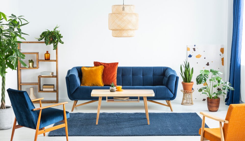
This year it is not surprising to see a modern color scheme like calm gray and sunny yellow chosen as Pantone Color of the Year. Take inspiration from the elegant Pantone combination, especially the meaning behind it. “Illuminating” is a soft, positive and relaxing yellow, while “Ultimate Gray” is a reliable shade of gray, just what we all need for the new year. Imagine a beautiful gray sofa in a textured fabric with a variety of accent pillows yellows. Or to really transform a room, paint the walls gray and add a pop of color with an eye-catching yellow armchair like the ones used in this project below.
Create energetic combinations of yellow and gray Ultimate Gray (Pantone: 17-5104) is soft and calm and Illuminating (Pantone 13-0647) is a playful touch of yellow that can bring your interior design to life. Together, they create a fun and energizing combination that keeps viewers on their toes. Design a yellow accented palette with lilac gray marble and soft gray textiles. The result will be a fresh yet sophisticated design that can be used in any room in the house.
Add pops of color with your wall decor. Experts suggest that the best way to bring the bold color of Illuminating into your home décor is through original wall décor. It incorporates the Pantone Colors of the Year for 2021 with other bold, neutral colors on a clean white background. Whimsical bedding and fantastic soft gray and bright yellow bedroom sheets are sure to lift your spirits.
As 2021 rolls by, it’s safe to assume that many of us design and decor buffs are looking for soft, calming palettes to introduce into our personal spaces. What better way to counteract all that negative energy, right? Fortunately for us, Pantone offered us not one, but two colors of the year, and we must say: we are in love with this winning combination.
Yellow can look like a youthful color, but you do want it to feel a little more sophisticated. So, balance it out with navy blue, a more subdued and earthy shade. This shade of yellow is very bright, cheerful and energizing. But, due to its boldness, it can easily take over a room. However, you can also pair it with black or brown, which would also offer that grounding element. Opt for more classic furniture and keep the overall space colorful and cheerful. Since yellow is so bold, follow a very simple pattern because you don’t want anything to clash to get attention in your space.
To finish our topic for today we can say that we are not talking only about interior design. These colors of the year speak to trends in fashion, art, graphic design, the entertainment industry and even take into consideration environmental influences around the world and the cultural moment we are in. Below we delve into Pantone colors, exploring more interior designs that include them, and presenting some photo options on how to incorporate these colors into your home. Scroll down for more inspiration on choosing a color palette with these trendy shades.